Introduction
Statistics is a branch of mathematics that deals with collecting, organising, presenting, analysing and interpreting data It is very important to know the objective of collecting the data. After the data has been collected it has to be presented in such a form that helps one to study easily and draw inferences quickly. This is called the distribution of presentation or organisation of data. Statistical data can be presented in the form of tables, pictures, graphs and diagrams with have a lasting effect on the observer’s mind. One such tool for presenting the statistical data is dot plots. Let us learn more about dot plots.
Definition
A dot plot is used to represent any data in the form of dots or small circles. Also known as a dot diagram, they are a statistical chart consisting of data points on a relatively simple scale. Considered as one of the easiest statistical tools, dot plots are used for small data sets. They are used for a number of purposes for highlighting statistical data such as gaps, clusters, outliers and skewed distribution. However, a dot plot is less manageable when used for data sets larger than 20 or 30. In other words, A dot plot, also called a dot chart or strip plot, is a type of simple histogram-like chart used in statistics for relatively small data sets where values fall into a number of discrete categories.
Let us understand it by an example.
Example
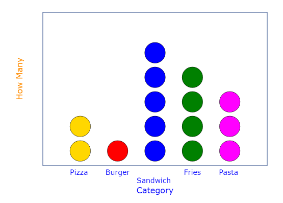
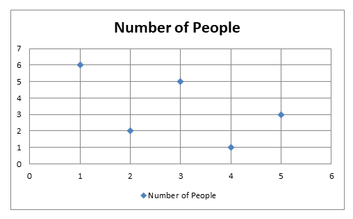
Suppose we have a small dataset that shows different types of foods preferred by different people the data provided is as follows –
| Food Preferred | Number of People |
| Pizza | 2 |
| Burger | 1 |
| Sandwich | 5 |
| Fries | 4 |
| Pasta | 3 |
The dot plot of the above data will be –
Let us now learn to solve dot plots.
Types of Dot Plots
There are two types of dot plots, namely –
- Wilkinson Dot Plot
- Cleveland Dot Plot
Let us learn about them one by one.
Wilkinson Dot Plot
The Wilkinson dot plot was created by Leland Wilkinson, which helps standardize the dot plot form. Wilkinson dot plot is similar to a histogram representing the distribution of continuous data points. For instance, you can represent the temperature in a room tour of the day using a with Wilkinson dot plot.
Let us understand it by an example.
Example
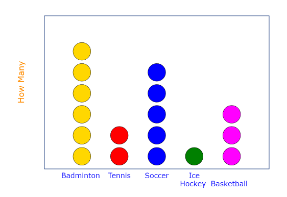
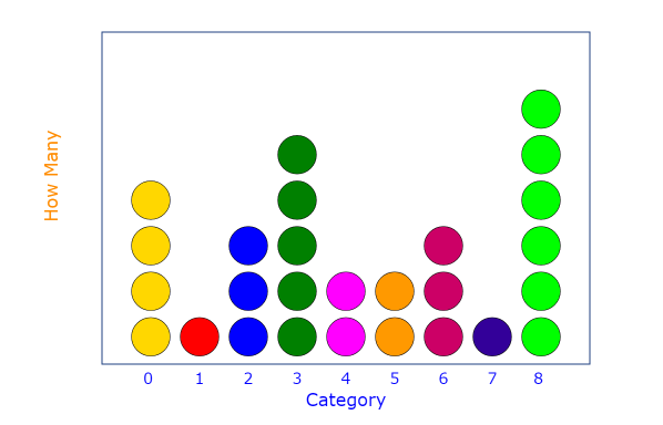
Suppose we have a small dataset which shows different types of sports preferred by different people the data provided is as follows –
| Sport Preferred | Number of People |
| Badminton | 6 |
| Tennis | 2 |
| Soccer | 5 |
| Ice Hockey | 1 |
| Basketball | 3 |
The dot plot of the above data will be –
Cleveland Dot Plot
Cleveland dot plot was created by William Cleveland. The Cleveland dot plot is similar to the usual bar chart and is a good alternative as a statistical tool especially if you have a few numbers of items. This type of dot plot is easier to read even if many more values are plotted in the same amount of space. It is slightly different than the bar chart as it uses location to represent the number of items instead of the duration of the data encoding value. The position of the dots in the graph represents a number of items of the data. The Cleveland dot plot is useful when using multiple variables, as it does not require the axis to start at zero, allowing for the use of a long axis.
Let us understand it by an example.
Example
Suppose we have a small dataset that shows different types of sports preferred by different people the data provided is as follows –
| Sport Preferred | Number of People |
| Badminton | 6 |
| Tennis | 2 |
| Soccer | 5 |
| Ice Hockey | 1 |
| Basketball | 3 |
The dot plot of the above data will be –
Solving Dot Plots
We now know that a dot plot is made up of dots plotted on a graph. So, if we are presented with a dot plot how do we solve it? For solving a dot plot it is important to understand the following points –
- Specific number of observations from a given set of data is denoted by each dot plotted on a dot graph. It has to be ensured that any dot that represents more than one of the observations should be written on the plot.
- Over each category the dots are then arranged in a column so that the absolute or the relative frequency of observation in the category is represented by the height of the column.
- It should be noted that only if the categories are quantitative, can the pattern of data found in a dot plot be clearly stated terms of symmetry. However, if the categories of qualitative the dot plot is not suitable for the description of those terms.
Compared to other graph plot are usually used for a small set of data and for plotting frequency count within a small number of categories.
How to Make a Dot Plot
Now that we have understood what we mean by dot plots, let us move to learn about plotting a dot plot.
Let us understand it with the help of an example.
Example
The following data shows the number of books which have been read by a number of kids during their winter break –
| Number of Books Read | Number of Kids |
| 0 | 4 |
| 1 | 1 |
| 2 | 3 |
| 3 | 5 |
| 4 | 2 |
| 5 | 2 |
| 6 | 3 |
| 7 | 1 |
| 8 | 6 |
The following steps will be used to plot a dot plot for the above given data –
- The first step towards making a dot plot is to create a horizontal scale. This scale must include all the values that are contained in the data set. In the above data set we can see that the smallest value given is 0 while the largest value is 8. For the sake of convenience we can give the title on the number line as the number of books.
- The second step involves the filling of the dots on the skin it is to be noted here that each value gets at dot therefore in order to take this latest a floating only the First row of the theatre we can see that each value is defined by a dot on the plot.
The dot plot thus made for the above data will be –
Dot Plot vs Scatter plot
How is a dot plot different from a scatter plot? The difference lies in their definitions themselves. A dot plot is a statistical chart that consists of data points that are vertically illustrated with dot-like markers. On the other hand, a scatter plot is a means to represent data in a graphical format. A simple scatter plot makes use of the Coordinate axes to plot the points, based on their values. The difference between a dot plot and a scatter plot can be summarised as under –
| Dot Plot | Scatter Plot |
| A dot plot is just a type of bar chart that uses dots to represent individual quanta. | A scatter plot puts a point representing a single realization of a tuple of data. |
| For example, if you wanted to plot the number of pets per household, you might have 10 households with 0 pets, 20 with 1 pet, 12 with 2 pets, etc. Over zero, you’d draw 10 dots; over one, you’d draw 20 dots, etc. | For example, if you measured people’s height and weight, you could create a scatter plot where one axis represented height and one represented weight. |
| It is used to plot categorical data along the x-Axis. | It is used to plot two groups of numbers as one series of x and y coordinates. |
Important Points Regarding Dot Plots
Here are some important points regarding dot plots –
Dot Plots vs Histogram
Dot plots are usually more preferred than histograms because the histogram by definition is a chart that groups the data into classes and represents information of those frequencies. On the other hand, a dot plot represents each observation on a number line. Moreover, for a small dataset dot plot is considered more appropriate than the histogram. Also in histograms, the identity of each observation is lost as the data is grouped into classes and then plotted while in the case of dot plot the identity of individual observation is not lost.
Uses of Dot Plots
Where do we find maximum use of dot plots? The dot plots are used for continuous, quantitative and univariate data. The dot plots can also be used for displaying any data in a school or a college or to convey important information to the viewers. Also, since the dot plots are easy to construct therefore in many places they are used to display information. Dot plots are also used for highlighting clusters or gaps.
Advantages and Disadvantages odd Dot Plots
Dot plots are essentially useful for small sets of data. They offer a visual means of comparison and don’t need frequency of the data to be put into the table. However, a disadvantage of the dot plot is that you need to count the total number of data elements in each stack of dots and at times it is difficult to construct and interpret data set for many points.
Examples
Example 1 Twenty-five seventh-grade students were asked to estimate how many hours a week they spend talking on the phone. This dot plot represents their reported number of hours of phone usage per week.
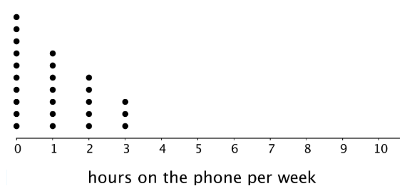
- How many of the students reported not talking on the phone during the week?
- What is the largest number of hours a student spent talking on the phone per week?
- What percentage of the students reported not talking on the phone?
Solution We have been given a dot plot and we are required to answer the questions that follow. Let us do them one by one.
- We have asked to determine the number of the students reported not talking on the phone during the week. In order to find this let us carefully observe the given dot plot. We know that not talking on the phone during the week means that it should be represented by 0 hours on the dot plot. Let us observe the number of dots on the dot plot for the value marked 0 on the x-axis. We notice that there are 10 zeros above the value marked 0 on the x-axis. This means that there were 10 kids who reported not talking on the phone during the week.
Hence, we can say that there were 10 kids who reported not talking on the phone during the week.
- We have been asked to determine the largest number of hours a student spent talking on the phone per week. In order to determine this, we need to observe the value of the x-axis and the number of dots against them. We can observe that the largest of the x-axis against which any dot has been marked is 3. This means that 3 is the maximum number of hours for which any kids would have spent talking on the phone.
Hence, the largest number of hours a student spent talking on the phone per week is 3
- We have been asked to determine the percentage of the students reported not talking on the phone. In order to determine this, we need to check the result obtained in the first part of the question. We had calculated that there were 10 kids who reported not talking on the phone during the week. Now, we have also been given that there were 25 kids in all. So, we have –
Number of kids who reported not talking on the phone during the week = 10
Total Number of kids = 25
Percent of kids who reported not talking on the phone during the week = $\frac{10}{25}$ x 100 = 40%
Hence, Percent of kids who reported not talking on the phone during the week is 40%
Example 2 The following dot plot illustrates each student’s marks in a maths test in school. A different student is represented by each dot. The maximum marks of the test were 10.
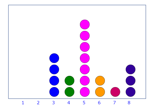
- What was the minimum score received by a student in the maths test?
- What is the score earned by the maximum number of students?
Solution We have been given a dot plot and we are required to answer the questions that follow. Let us do them one by one.
- We have been asked to determine the minimum score for a student in the maths test. Let us observe the dot plot carefully. The lowest number of the x-axis against which any dot has been marked is 3. This means that this is the lowest mark any student would have got in the test.
Hence, the minimum score received by a student in the maths test is 3
- We have been asked to determine the score earned by the maximum number of students. Again, let us observe the dot plot carefully. There are dots against some values on the x-axis while there are no dots on others. Let us write down the count of the number of dots against each value on the x-axis. We have,
| Marks obtained in the Test | Number of Dots |
| 1 | 0 |
| 2 | 0 |
| 3 | 4 |
| 4 | 2 |
| 5 | 7 |
| 6 | 2 |
| 7 | 1 |
| 8 | 3 |
From the table above, we can see that the maximum number of dots has been marked against the value 5. This means that 5 is the mark that the maximum number of students have got.
Hence, the score earned by the maximum number of students = 5
Key Facts and Summary
- A dot plot also called a dot chart or strip plot is a type of simple histogram-like chart used in statistics for relatively small data sets where values fall into a number of discrete categories.
- There are two types of dot plots, namely, Wilkinson Dot Plot and Cleveland Dot Plot.
- Only if the categories are quantitative, can the pattern of data found in a dot plot be clearly stated terms of symmetry. However, if the categories of qualitative the dot plot is not suitable for the description of those terms.
- The Wilkinson dot plot was created by Leland Wilkinson, which helps standardize the dot plot form. Wilkinson dot plot is similar to a histogram representing the distribution of continuous data points.
- Cleveland dot plot is similar to the usual bar chart and is a good alternative as a statistical tool especially if you have a few numbers of items. This type of dot plot is easier to read even if many more values are plotted in the same amount of space.
- A scatter plot is a means to represent data in a graphical format. A simple scatter plot makes use of the Coordinate axes to plot the points, based on their values.
- Dot plots are usually more preferred than histograms because the histogram by definition is a chart that groups the data into classes and represents information of those frequencies.
- The dot plots are used for continuous, quantitative and univariate data.
- Dot plots are essentially useful for small sets of data.
- A disadvantage of the dot plot is that you need to count the total number of data elements in each stack of dots and at times it is difficult to construct and interpret the data set for many points.