Introduction
Statistics is a branch of mathematics that deals with the study of collecting, analysing, interpreting, presenting, and organizing data in a particular manner. In other words, Statistics is the branch of mathematics that revolves around the collection of data. After the collection of data, we have to find ways to condense them in tabular form in order to study their salient features. Such an arrangement is called the presentation of data. One such form of presentation of data is through histograms. What is a histogram and how is used for presenting, interpreting and analysing of data? Let us find out.
Before we learn more about histograms, let us recall what we mean by frequency as it is integral to the understanding of histograms.
Frequency distribution
Frequency table or frequency distribution is a method to present raw data in the form, from which one can easily understand the information contained in the raw data. This frequency table tells the number of times a variable occurs in the raw data. Let us understand it through an example.
Example
Given below are the ages of 25 students of Grade 8 in a school. Find out the frequency of each class.
15, 16, 16, 14, 17, 17, 16, 15, 15, 16, 16, 17, 15, 16, 16, 14, 16, 15, 14, 15, 16, 16, 15, 14, 15
Solution
We have been given the following data of the ages of 25 students of Grade 8 in a school
15, 16, 16, 14, 17, 17, 16, 15, 15, 16, 16, 17, 15, 16, 16, 14, 16, 15, 14, 15, 16, 16, 15, 14, 15
We need to find the frequency of each class.
Let us first arrange the data in the tabular form. We can see that there are 4 students of age 14, while there are 8 students aged 15. Similarly, we can see that there are 10 students of the age 16 while there are 3 students of the age 17. Hence, 4 is the frequency for the age 14, 8 is the frequency for the age 15, 10 is the frequency for the age 16 and 17 is the frequency for the age 17. Presenting this data in tabular form, we will have,
| Age | Frequency |
| 14 | 4 |
| 15 | 8 |
| 16 | 10 |
| 17 | 3 |
The above is the required frequency table for the given data.
Definition
A Histogram is a graphical representation of the distribution of data. In other words, a histogram is a chart that plots the distribution of a numeric variable’s values as a series of bars. Sets of rectangles, placed adjacent to each other are used to make histograms in which each bar represents a kind of data.
Let us understand it through an example.
Example
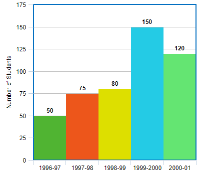
The following table gives the number of students of grade VI in a school during academic years 1996 – 97 to 2001 – 2001.
| Academic Year | 1996 – 97 | 1997 – 98 | 1998 – 99 | 1999 – 2000 | 2000 – 2001 |
| Number of Students | 50 | 75 | 80 | 150 | 120 |
Represent the above data using a histogram.
Solution
We have been given the data –
| Academic Year | 1996 – 97 | 1997 – 98 | 1998 – 99 | 1999 – 2000 | 2000 – 2001 |
| Number of Students | 50 | 75 | 80 | 150 | 120 |
We need to prepare a histogram for this data. We shall plot the years on the x – axis and the number of students on the y – axis. The histogram for this data shall be –
Let us understand the different parts of the histogram.
Parts of a Histogram
A histogram consists of many parts. The parts that make a complete histogram are –
Title – Title is the most important part of a histogram. The description of a histogram such as what it is about is all declared in the title.
x –axis – The x – axis is the horizontal axis of the histogram that describes the class intervals in which the frequencies have been divided.
y – axis – The y – axis is the vertical axis of the histogram that describe the range of the frequencies of the histogram.
Bars – The bars are the rectangles that represent the number of times that the values occurred within the interval. The interval that is covered is represented by the width of the bar.
Let us now learn how to plot a histogram.
How to Plot a Histogram?
The following are the steps involved in making a histogram for a given set of data –
- Choosing a suitable scale for the purpose of representing the weights on the horizontal axis or the x – axis is the first step. This can also be stated as marking the class intervals on the x – axis.
- The next step is choosing a suitable scale for the purpose of representing the frequencies on the vertical axis or the y – axis. This can also be stated as marking the class intervals on the y – axis.
- It is important to note that in the above two steps the class intervals need to be exclusive.
- The next step involves drawing bars corresponding to each of the given weights using their frequencies. These bars are drawn by constructing rectangles with bases as class intervals and corresponding frequencies as heights.
- Since the class limits are marked on the horizontal axis and the frequencies are indicated on the vertical axis, therefore, a rectangle is built on each class interval.
- There should not be any gap between two successive bars.
Let us understand the above steps through an example.
Example
Suppose a teacher wants to analyse the performances of two sections of students in mathematics. After having looked at their performances, she found that a few students got less than 20 marks while some others scored 70 marks or above. Hence, she decided to group them into intervals of varying sizes as follows –
| Marks | Number of Students |
| 0 – 20 | 7 |
| 20 – 30 | 10 |
| 30 – 40 | 10 |
| 40 – 50 | 20 |
| 50 – 60 | 20 |
| 60 – 70 | 15 |
| 70 above | 8 |
| Total | 90 |
Create a histogram graph of the above data.
Solution
We have been given a data which has uneven distribution of class intervals. We are required to create a histogram graph of the above data. Since, the class intervals are not in the same proportion, we will have to make some changes in the representation of data. From the data above, we can notice that if the class size is 20, the length of the rectangle is 7. This means that when the class size is 10, the length of the rectangle will be 720 x 10 = 3.5. In similar manner, we can modify the given table as follows –
| Marks | Number of Students | Width of the Class | Length of the Class |
| 0 – 20 | 7 | 20 | 3.5 |
| 20 – 30 | 10 | 10 | 10 |
| 30 – 40 | 10 | 10 | 10 |
| 40 – 50 | 20 | 10 | 20 |
| 50 – 60 | 20 | 10 | 20 |
| 60 – 70 | 15 | 10 | 15 |
| 70 above | 8 | 10 | 2.67 |
| Total | 90 |
Using this table, can now create the histogram as –
Now that we have learnt how to plot a histogram, let us learn about the general characteristics of a histogram.
Characteristics of a Histogram
The following are the general characteristics of a histogram –
- A histogram is used to display continuous data in a categorical form.
- In a histogram, there are no gaps between the bars, unlike a bar graph.
- The width of the bars is equal.
- The scales of both horizontal and vertical axes don’t need to start from 0.
A common mistake that often occurs regarding the use of a histogram is that it is mistaken for a bar graph. However, bar graph and histogram are quite different from each other. So, what are the differences between the two? Let us find out.
Histogram vs Bar Graph
Histogram and bar graphs are both commonly used to represent the frequency distribution of a data. Although they both have some similarities yet they have their share of differences as well. The following are the differences between a histogram and a bar graph
| Histogram | Bar Graph |
| It is 2 dimensional figure | It is a one dimensional figure |
| It is used to constitute statistical information by way of bars to display the frequency distribution of uninterrupted data. | It is used to compare the frequency, total count, sum, or average of data in different classifications by using horizontal or vertical bars. |
| A histogram represents quantitative data | A bar graph represents categorical data |
| There are no spaces between the bars in a histogram. | There are spaces between the bars in a bar graph. |
| In a histogram, elements are grouped together | In a bar graph, elements are taken individually |
| In a histogram, X-axis should represent only continuous data that is in terms of numbers. | In a bar graph, x-axis can represent anything. |
| The frequency is shown by the area of each rectangle | The height shows the frequency and the width has no significance. |
Types of Histograms
Based on the frequency distribution of the data, there are four types of histograms –
- Uniform histogram
- Symmetric or Bell-shaped histogram
- Bimodal histogram
- Probability histogram
Let us learn about these one by one.
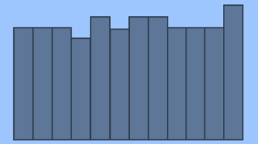
Uniform Histogram
The data that is extremely compatible is represented by a uniform histogram. In this histogram, the frequency of each class is much related to that of the others. The number of classes in a uniform histogram is quite small and there are same numbers of elements in each class. The following is the general representation of a uniform histogram –
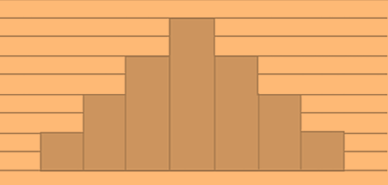
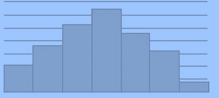
Symmetric Histogram
A major characteristic of a symmetric histogram is that it has a mound at the centre and tapering related to it at both left and the right side. Due to this characteristic, a symmetric histogram is also known as bell shaped histogram. In other words, when a vertical line is drawn down the centre of the histogram, and the two sides are identical in size and shape, the histogram is said to be symmetric. The following is the general representation of a symmetric or a bell shaped histogram –
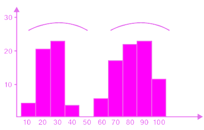
Bimodal histogram
A bimodal histogram, as the name suggests has two peaks instead of one. Such a representation occurs when the data set has observations on two different kinds of individuals or combined groups. In other words, a bimodal histogram has two separated classes or intervals equally representing the maximum frequency of the distribution. The following is the general representation of a bimodal histogram –
Probability histogram
A probability histogram is used to represent a pictorial representation of a discrete probability distribution. Each rectangle in a probability histogram is centred on the value of x. Also, in this histogram, each rectangle and the probability of the corresponding value are proportional to each other. The following is the general representation of a probability histogram –
Applications of Histograms
Histograms are widely used for various statistical purposes. Below are some areas where histogram is extensively used to represent frequency distributions –
Stock exchange
Histograms are extensively used in stock exchanges for the purpose of identification of different groups of investors or different places.
Medical and Clinical Research
Histogram finds it use in medical and clinical research where it is used for the purpose of identification of presence or absence of certain conditions among different sets of people.
Photography
Histograms are used in photography for the purpose of processing of images as well as for digitisation.
Six Sigma
In six sigma, a histogram is used for the studying the defect patterns across various categories of samples.
Solved Examples
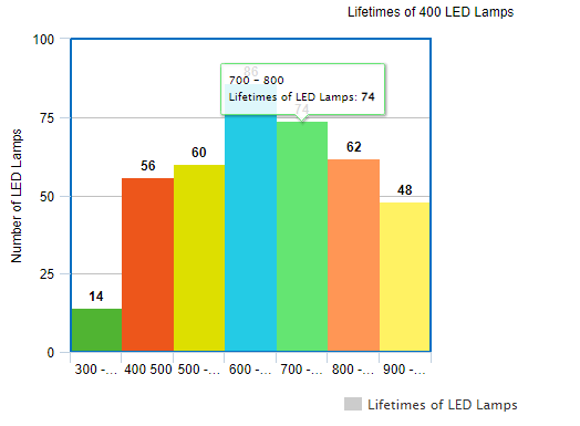
Example 1 The following table gives the lifetimes of 400 LED lamps. Draw the histogram for the below data.
| Lifetime | Number of Lamps |
| 300 – 400 | 14 |
| 400 – 500 | 56 |
| 500 – 600 | 60 |
| 600 – 700 | 86 |
| 700 – 800 | 74 |
| 800 – 900 | 62 |
| 900 – 1000 | 48 |
Solution We have been given the lifetimes of 400 LED lamps in the form of the following data.
| Lifetime | Number of Lamps |
| 300 – 400 | 14 |
| 400 – 500 | 56 |
| 500 – 600 | 60 |
| 600 – 700 | 86 |
| 700 – 800 | 74 |
| 800 – 900 | 62 |
| 900 – 1000 | 48 |
We are required to prepare a histogram chart for the same. In the above data, we can see that there is equal distribution of class intervals. Therefore, we can use the table as it is to create the corresponding histogram chart.
The histogram chart of the above data will be as shown below –
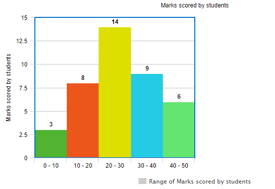
Example 2 The marks obtained by 40 students in an examination are given below –
27, 18, 15, 21, 48, 25, 49, 29, 27, 21, 19, 45, 14, 34, 37, 34, 23, 45, 24, 42, 8, 47, 22, 31, 17, 13, 38, 26, 3, 34, 29, 11, 22, 7, 15, 24, 38, 31, 21, 35
Prepare a histogram chart for the above data.
Solution We have been given the marks obtained by 40 students in an examination. The marks are –
27, 18, 15, 21, 48, 25, 49, 29, 27, 21, 19, 45, 14, 34, 37, 34, 23, 45, 24, 42, 8, 47, 22, 31, 17, 13, 38, 26, 3, 34, 29, 11, 22, 7, 15, 24, 38, 31, 21, 35
We are required to prepare a histogram chart for the same. We can see that the data given is in raw form and we would first need to define class intervals and prepare a frequency table of the given data. The frequency table for this data will be –
| Class Interval ( Range of Marks ) | Number of Students |
| 0 – 10 | 3 |
| 10 – 20 | 8 |
| 20 – 30 | 14 |
| 30 – 40 | 9 |
| 40 – 50 | 6 |
| Total | 40 |
Now, that there is equal distribution of class intervals, therefore, we can use the table as it is to create the corresponding histogram chart.
The histogram chart of the above data will be as shown below –
Key Facts and Summary
- A histogram is a chart that plots the distribution of a numeric variable’s values as a series of bars.
- Frequency table or frequency distribution is a method to present raw data in the form, from which one can easily understand the information contained in the raw data.
- The description of a histogram such as what it is about is all declared in the title.
- The x – axis is the horizontal axis of the histogram that describes the class intervals in which the frequencies have been divided.
- The y – axis is the vertical axis of the histogram that describe the range of the frequencies of the histogram.
- The bars are the rectangles that represent the number of times that the values occurred within the interval. The interval that is covered is represented by the width of the bar.
- Based on the frequency distribution of the data, there are four types of histograms – Uniform histogram, Symmetric or Bell-shaped histogram, Bimodal histogram and probability histogram.
- The data that is extremely compatible is represented by a uniform histogram.
- In a symmetric histogram there is a mound at the centre and tapering related to it is at both left and the right side.
- A bimodal histogram, as the name suggests has two peaks instead of one.
- A probability histogram is used to represent a pictorial representation of a discrete probability distribution.
Recommended Worksheets
Histogram (Hospital Themed) Math Worksheets
Constructing Statistical Displays 6th Grade Math Worksheets
Understanding Picture Graph and Bar Graph 2nd Grade Math Worksheets