Introduction
Graphs can be challenging to understand immediately since different information must be read to do so. Charts and graphs called pictograms use icons and pictures to represent data.
Pictograms can be helpful for everyone because this difficulty affects both adults and children equally.
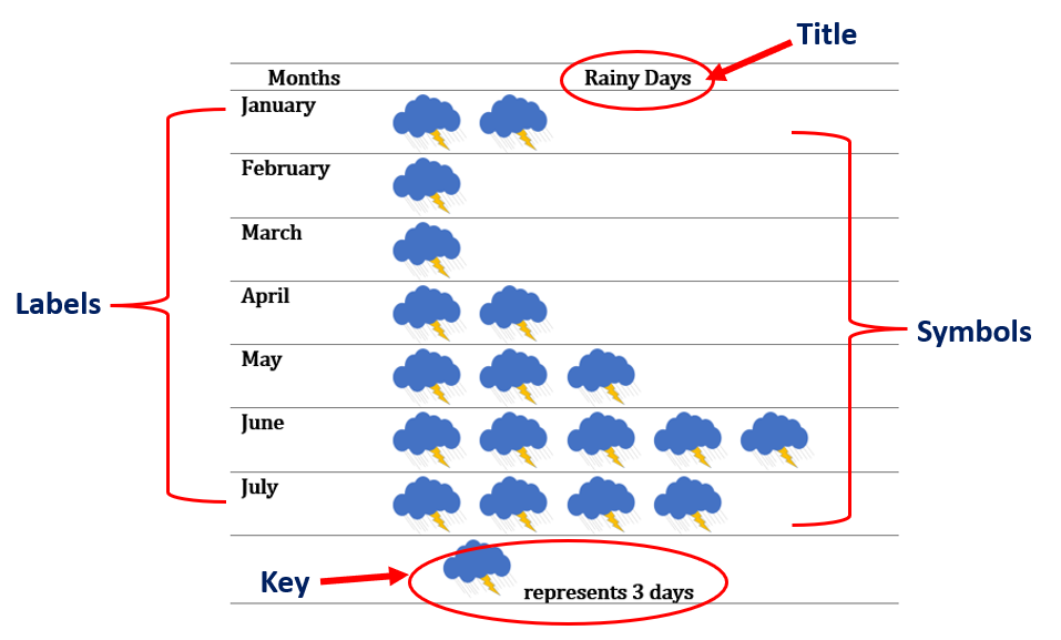
A pictogram, also known as a pictograph, is a diagram or chart that shows data. Instead of using a single way to display data, like bar graphs or line graphs do, pictograms use images, with each image representing a distinct actual object. An illustration of a pictograph that will show us how many rainy days there are in each month is shown in the figure below.
| Months | Rainy Days |
| January | |
| February | |
| March | |
| April | |
| May | |
| June | |
| July |
![]() represents 3 days
represents 3 days
In this article, we will define a pictogram, look at a few examples, learn when and how to utilize them, and go over their advantages and disadvantages.
What is a Pictogram?
Definition
Pictograms, also known as pictographs, are symbols that are used repeatedly to express data visually. Each icon denotes a given number of units and is organized in a single line or grid. Pictographs are considered one of the simplest methods for representing data.
Using a pictograph, we can depict the frequency of data using pertinent symbols or images.
Pictographs are frequently used in mathematics to explain concepts like information processing and establish the basis for data interpretation using imagery.
Parts of a Pictogram
The following parts must be present for a pictograph to be complete.
( 1 ) Title
Typically, the graph’s title appears at the top. What the graph is about is clear from the title.
( 2 ) Symbols or Pictures
A certain amount of data is represented by the symbols.
( 3 ) Categories or Labels
The categories identify the exact type of data in the graph.
( 4 ) Key or Legend
How much each image stands for is denoted by a key.
Let us look at the pictograph below and identify its parts
The pictograph below shows the number of flowers sold in a week.
| Day | Flowers Sold |
| Monday | |
| Tuesday | |
| Wednesday | |
| Thursday | |
| Friday | |
| Saturday | |
| Sunday |
![]() = 10 flowers
= 10 flowers
The idea that the pictogram represents the quantity of sold flowers is instantly conveyed by the title “Flowers Sold.” The “Day” categories, which run from Monday through Sunday, inform us of the days that are part of a week. The symbol ![]() in the pictogram is used to denote a specific number of flowers. Each flower is equal to 10 flowers, according to the key,
in the pictogram is used to denote a specific number of flowers. Each flower is equal to 10 flowers, according to the key, ![]() = 10 flowers. Therefore, to calculate the total number of flowers sold each day, multiply the number of flowers on each day by 10.
= 10 flowers. Therefore, to calculate the total number of flowers sold each day, multiply the number of flowers on each day by 10.
Since we know that 1 flower ( ![]() ) equals 10 sold flowers, we just need to apply some basic math to figure out how many flowers were sold each day. Hence, we have,
) equals 10 sold flowers, we just need to apply some basic math to figure out how many flowers were sold each day. Hence, we have,
Monday: 5×10=50 flowers
Tuesday: 7×10=70 flowers
Wednesday: 4×10=40 flowers
Thursday: 6×10=60 flowers
Friday: 11×10=110 flowers
Saturday: 10×10=100 flowers
Sunday: 14×10=140 flowers
Other than the total number of flowers sold each day, the pictogram may provide answers to further inquiries. Through analysis, we can also determine the total number of flowers sold in a given week, the day on which the most or least flowers were sold, etc.
How To Make a Pictogram?
Below are some important points in creating a pictogram:
Collect the data
The first step in creating a pictograph is to gather the relevant data that we want to show. Once the data has been collected, arrange it in a table or list. The data categories must also be correctly specified.
Selecting the appropriate symbols
Select visual representations for the data, such as symbols or images. The most relevant symbols or visual representations of the provided data must be used. Fractions can be drawn for the symbols if the frequency is not a whole number.
Assign a key
Use a key to indicate the value of each image when displaying the data using images because one image cannot adequately depict the data if the frequency of the data is too high. As a result, the “key” numerical value, which must also be written with the pictograph, is used.
Use columns
When making a pictogram, use columns to indicate the category and data. Create a pictogram that represents the frequency of data using symbols and/or images.
Examine the data
Once the pictograph has been created, check that the categories or labelling and the images must accurately reflect the data.
Consider the avocado, coconut, lemon, mango, orange, and pear trees found on a farm. Let us create a pictogram that displays how many trees are on a farm.
Collect the data
The data gathered are shown in the table below. The count and tree types are presented.
| Avocado | Coconut | Lemon | Mango | Orange | Pear |
| 20 | 35 | 15 | 25 | 10 | 30 |
Selecting the appropriate symbols
We will use the symbol ![]() as a visual representation of trees. Selecting an image for the symbol is important and should be relevant to the data collected.
as a visual representation of trees. Selecting an image for the symbol is important and should be relevant to the data collected.
Assign a key
Since the given data is a multiple of 5, we will represent each symbol equal to 5 trees. So, we have, ![]() = 5 trees. You might want to use a different symbol’s numerical equivalent. Just be sure that your images’ final count corresponds to the number of trees.
= 5 trees. You might want to use a different symbol’s numerical equivalent. Just be sure that your images’ final count corresponds to the number of trees.
Use columns
In constructing the pictograph for the data collected, we will use two columns. The labels in the first column are the types of trees. The second column indicates the number of trees.
| Types of Trees | Number of Trees |
| Avocado | |
| Coconut | |
| Lemon | |
| Mango | |
| Orange | |
| Pear |
![]() = 5 trees
= 5 trees
Examine the data
Regarding the data gathered, each row must accurately reflect the total number of trees in each category. There should be four trees as there are a total of 20 avocado trees. Seven trees will be used to represent the coconut, three for the lemons, five for the mango, two for the orange, and six for the pear.
| Types of Trees | Number of Trees |
| Avocado | |
| Coconut | |
| Lemon | |
| Mango | |
| Orange | |
| Pear |
![]() = 5 trees
= 5 trees
We have now successfully made the pictograph of the number of trees on the farm.
Using addition, let us show the accuracy of the numbers:
| Avocado | 5 + 5 + 5 + 5 = 20 |
| Coconut | 5 + 5 +5 + 5 + 5 + 5 + 5 = 35 |
| Lemon | 5 + 5 + 5 =15 |
| Mango | 5 + 5 + 5 + 5 + 5 = 25 |
| Orange | 5 + 5 = 10 |
| Pear | 5 + 5 + 5 + 5 + 5 + 5 =30 |
Why Do People Use Pictograms?
Pictograms are used for a variety of reasons, some of which are described below.
( 1 ) Pictograms can be used to add visual significance to simple data, whether you wish to represent a fraction or % or indicate the size of an important statistic.
( 2 ) When visualizing data in infographics, reports, presentations, and even resumes, pictograms can be quite useful. Pictograms can also be eye-catching and exceptionally clean, making them more pleasing to the eye.
( 3 ) Pictogram is useful when you want to make straightforward information more aesthetically appealing, memorable, or engaging. Readers can quickly determine what a chart is attempting to convey since they can read charts more easily than any other type of data display.
( 4 ) Since pictograms are very visual and typically simple to comprehend and interpret, pictograms are an excellent approach to educating kids about data processing. Children can simply count the items to determine the quantity of each item.
( 5 ) With the proper use of a key in the pictograph, children and adults can easily deduce important information from the data presented.
( 6 ) Pictograms are also useful when you need an eye-catching visual but don’t have access to a graphic designer because they are created from a collection of icons.
( 7 ) Pictograms are used in much the same way outside of the classroom, assisting viewers in connecting a bar chart to the concept it depicts.
( 8 ) People can better understand the meaning of numbers in situations like when a huge number is involved.
( 9 ) Pictograms are used to summarize survey data, rate participants, and show progress toward a goal.
( 10 ) Pictograms may be used in advertisements to manage data and display the general consensus on a given subject. Pictograms may be used in ads to demonstrate a product’s level of appeal or a problem that it may solve for consumers.
Importance in Statistics
Pictographs are charts used in statistics to represent data using graphics and icons that are appropriate to the data. A pictograph frequently has a key that describes what each symbol or image stands for. The pictogram’s icons must all have the same size, but we can use a fraction of an icon to represent each fraction of the total.
Since pictograph communicates the interpretation of statistical data via pictorial symbols, they should be utilized with care because they could unintentionally or intentionally mislead the data. For this reason, a pictograph needs to be accurate. Pictograms use a statistical infographic to make bland statistics or data points more interesting.
The pictogram’s stylized representation is used in statistics and research for the purpose of quick and effective information transfer without the use of language or words.
Examples
Example 1
Mario and his group fix cars. The number of cars they have serviced each week is shown in the pictogram below.
| Week | Number of Cars Serviced |
| Week 1 | |
| Week 2 | |
| Week 3 | |
| Week 4 |
![]() = 2 cars
= 2 cars
( a ) During which time did Mario and his crew have the most number of cars serviced?
( b ) From Week 1 to Week 4, how many cars did Mario and his team service in total?
Solution:
Let us look at the number of cars in each week. We have,
Week 1: 5 cars
Week 2: 7 cars
Week 3: 6 cars
Week 4: 9 cars
( a ) During which time did Mario and his crew have the most number of cars serviced?
From the data collected, we can say that week 4 was the time Mario and his crew had the most cars serviced.
( b ) From Week 1 to Week 4, how many cars did Mario and his team service in total?
Let us get the actual number of cars serviced by Mario’s team by multiplying the number of cars each week in the pictogram by 2.
Week 1: 5×2=10 cars
Week 2: 7×2=14 cars
Week 3: 6×2=12 cars
Week 4: 9×2=18 cars
Adding the total number of cars each week, we have,
10+14+12+18=54 cars
Hence, Mario and his team were able to service 54 cars in 4 weeks.
Example 2
A trader’s weekly egg sales are shown in a pictogram. Answer each question using the pictogram below.
| Days | Eggs Sold |
| Monday | |
| Tuesday | |
| Wednesday | |
| Thursday | |
| Friday | |
| Saturday | |
| Sunday |
![]() = represents 20 eggs
= represents 20 eggs
(a) How many eggs were sold on Wednesday?
(b) On which day the fewest eggs were sold?
(c) On which day the most eggs are sold?
(d) How many eggs were sold from Monday through Sunday?
Solution:
Let us use the provided pictogram to answer the questions about the eggs that the trader sold.
(a) How many eggs were sold on Wednesday?
The given key must be used to determine how many eggs were sold on Wednesday. On Wednesday, there are 7 eggs; thus, we must multiply 7 by 20. Hence, we have,
7×20=140 eggs
Therefore, 140 eggs in total were sold on Wednesday.
(b) On which day the fewest eggs were sold?
The pictogram clearly shows that Monday is the day with the least amount of egg sales. We have five eggs, according to the number of eggs displayed on Monday. Thus, we have,
5×20=100 eggs
As a result, Monday sells 100 eggs, the fewest number of eggs.
(c) On which day the most eggs are sold?
Sunday is the day when the most eggs are sold. We must multiply 15 by 20 to get the actual number of eggs sold because there are 15 eggs in the row on Sunday. That is,
15×20=300 eggs
With a total of 300 eggs sold, Sunday has the highest amount of egg sales.
(d) How many eggs were sold from Monday through Sunday?
We must first determine how many eggs were sold from Monday through Sunday in order to determine how many eggs were sold overall for the whole week. In terms of math:
| Monday: 5×20=100 eggs |
| Tuesday: 8×20=160 eggs |
| Wednesday: 7×20=140 eggs |
| Thursday: 9×20=180 eggs |
| Friday: 10×20=200 eggs |
| Saturday: 12×20=240 eggs |
| Sunday: 15×20=300 eggs |
Let us add the number of sold eggs each day:
100+160+140+180+200+240+300=1320 eggs
Therefore, there is a total of 1320 eggs sold by the trader for the week.
Example 3
The amount that seven friends raised for a charity is shown in the pictogram below.
| Names | Raised Money for Charity |
| Marcel | |
| Edward | |
| Kevin | |
| Camille | |
| Leah | |
| Bryan | |
| Michael | |
( a ) How much did Edward raise?
( b ) How much did Bryan raise?
( c ) Who raised the most money for the charity?
( d ) Who raised the least money for the charity?
( e ) How much more did Camille raise than Marcel?
( f ) How much more did Bryan raise than Leah?
( g ) How much money did they raise overall?
Solution:
The data collected from the pictograph is as follows:
| Marcel: 3 | Edward: 4 | Kevin: 5 ½ | Camille: 5 |
| Leah: 3 ½ | Bryan: 6 ½ | Michael: 8 |
We will use the given key for each money symbol equal to $10. Thus, we must multiply each by 10.
( a ) How much did Edward raise?
Multiplying 4 by $10: 4×$10=$40. Hence, Edward raised $40.
( b ) How much did Bryan raise?
Bryan has ½ of the money symbol in the graph, which corresponds to $5 or ½ of $10. Therefore, to calculate how much Bryan raised, we have,
( 6×$10 ) +$5=$60+$5=$65
( c ) Who raised the most money for the charity?
Michael has the most number of money symbols, which is 8. To get the actual value, we have,
8×$10=$80
( d ) Who raised the least money for the charity?
Marcel collected the least amount of money for the charity having 3 money symbols.
( e ) How much more did Camille raise than Marcel?
From the pictograph, Camille has 5 while Marcel has 3. Getting the difference ( 5 – 3 ) will give us 2. This number must be multiplied by $10. Hence, Camille raised more money than Marcel, amounting to $20.
(f) How much more did Bryan raise than Leah?
Bryan raised a total of $65, while Leah raised $35. Therefore, Bryan raised $30 more than Leah.
(g) How much money did they raise overall?
Let us show how to calculate the money each of them raised.
Marcel: 3×$10=$30
Edward: 4×$10=$40
Kevin: ( 5×$10 ) + ( $5×1 ) =$55
Camille: 5×$10=$50
Leah: ( 3×$10 ) + ( $5×1 ) =$35
Bryan: ( 6×$10 ) + ( $5×1 ) =$65
Michael: 8×$10=$80
Adding all the money they raised, we have,
$30+$40+$55+$50+$35+$65+$80=$355
Therefore, the seven friends raised a total of $355 for the charity.
Summary
Definition: Pictograms, also known as pictographs, are symbols that are used repeatedly to express data visually. Pictographs are considered one of the simplest methods for representing data. Using a pictograph, we can depict the frequency of data using pertinent symbols or images.
Parts of a Pictogram
The following parts must be present for a pictograph to be complete.
( 1 ) Title: What the graph is about is clear from the title.
( 2 ) Symbols: The symbols represent a certain amount of data.
( 3 ) Categories: The categories identify the exact type of data in the graph.
( 4 ) Key or Legend: A key denotes how much each image stands for.
How To Make a Pictograph?
Below are some important points that must be considered in creating a pictograph:
Collect the data
Selecting the appropriate symbols
Examine the data and pictogram.
Assign a key or legend
Use columns
Frequently Asked Questions on Pictogram
( FAQs )
What is meant by pictogram?
A pictogram is a visual representation of data that uses pictures or symbols. The frequency of the data is represented by each image.
What are the advantages of using pictograms?
The following are some of the advantages pictograms offer.
( 1 ) Pictograms can be used to add visual significance to simple data, whether you wish to represent a fraction or % or indicate the size of an important statistic.
( 2 ) Pictograms are eye-catching and exceptionally clean, making them more pleasing to the eye.
( 3 ) Pictograms are simple to comprehend and interpret.
( 4 ) Pictograms help people better understand the meaning of the numbers in situations like when a huge number is involved.
What are the disadvantages or limitations of using pictograms?
The disadvantages or limitations of using pictograms are as follows:
(1 ) The use of pictograms may unintentionally mislead data.
( 2 ) The use of symbols or icons must be of equal size.
( 3 ) Partial images are difficult to quantify
( 4 ) Pictographs may be used for a limited number of categories.
What are the other names of pictograms?
Pictograms are also known as pictographs, picture charts, icon charts, and pictorial charts.
What are the common parts of pictograms?
The common parts of pictograms are the title, labels, symbols, and key.
How to draw a pictogram?
The following steps must be done to draw a pictogram:
( 1 ) Use a table to show the frequency of collected data.
( 2 ) Give an appropriate title for the pictogram.
( 3 ) Select and use appropriate symbols to represent the data.
( 4 ) Assign a key for the used symbol, which indicates how much each symbol or image stands for.
( 5 ) Construct the pictograph based on the collected data.
Recommended Worksheets
Pictogram (National Hispanic Heritage Month Themed) Math Worksheets
Scaling Picture Graph and Bar Graph 3rd Grade Math Worksheets
Applying Concept of Inferential Statistics (Estimation of Parameters) 7th Grade Math Worksheets