Introduction
When expressing a fraction or ratio as a portion of one hundred, percentages are a significant mathematical and practical concept. Percentages are frequently applied in a range of disciplines, including science, finance, and statistics. Graphing percentages allows us to comprehend ratios, changes, or comparisons better.
Grade Appropriateness
The concept of percentages is typically introduced in the 5th or 6th grade and continues to be relevant throughout middle and high school. Graphing percentages, which combines understanding of percentages with data representation skills, is generally suitable for students aged 11 to 15 years or from the 6th to 9th grades.
Math Domain
This topic falls under the domains of Numbers and Operations—Fractions, Ratios and Proportional Relationships, and Measurement and Data.
Applicable Common Core Standards
The topic directly addresses several Common Core State Standards for Mathematics, including:
CCSS.MATH.CONTENT.6.RP.A.3.C: Find a percent of a quantity as a rate per 100.
CCSS.MATH.CONTENT.7.RP.A.3: Use proportional relationships to solve multistep ratio and percent problems.
CCSS.MATH.CONTENT.6.SP.B.4: Display numerical data in plots on a number line, including dot plots, histograms, and box plots.
Definition of the Topic
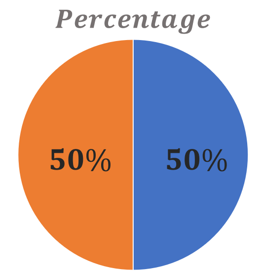
A number can be expressed as a fraction of 100 using a percentage. It is often indicated with the percent sign, “%.”For example, 50% is a percentage that represents 50 out of 100, or half.
Graphing percentages involves representing these percentages visually, often on a bar graph, line graph, or pie chart. Graphing percentages helps in understanding the distribution and comparison of data more effectively.
Key Concepts
Percent: A ratio that weighs a value of 100.
Fraction: A way of representing a part of a whole using a numerator (part) and a denominator (whole). Put percentages over 100 to convert them to fractions.
Decimal: Percentages can also be expressed as decimals. For example, 50% is equal to 0.5 in decimal form.
Graphs: Visual representations of data. They can be used to show percentages in a visually intuitive way.
Discussion with Illustrative Examples
Meaning of Percentage
The word percentage comes from the Latin per centum, which means “per one hundred” or “by a hundred.”
Therefore, percentages are fractions with 100 as their denominator. It is the concept of a part and a whole where the value of the whole is always 100.
Percentage Formula
The meaning of percentage means “by the hundred” or “per one hundred.” The whole value of a percentage is always based on 100, while individual values are a part of this 100. For example, 40% means 40 out of 100.
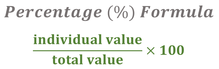
Percentage = ( individual value ÷ total value ) x 100
Calculating the Percentage
To find the percentage of a certain value, we divide the individual value by the total value and then multiply the result by 100.
Let us say, for example, the favorite color of 6 students out of a total of 10 students is blue. What is the percentage value of students whose favorite color is blue?
The total value, in this case, is ten students.
Divide the individual value that you wish to determine the percentage for by the total value.
Based on the example above, the individual value is six students. We are looking for the percentage value of 6 students out of the total value of 10 students.
Six students divided by ten students: 6 ÷ 10 = 0.6
Multiply the value you got by 100: 0.6 x 100 =60%

Out of 10 students in the school, the favorite color of 60% of them is blue.
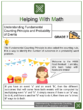
Graphing Percentages
Once we have collected the data and converted it to percentages, creating a visual form of this information in a presentation is practical and helpful. A graph organizes the data and will make it easier for people who need to use this data to analyze the values.
Here are some basic graphs that we can use to graph percentages:
Pie Graph
The pie graph is the best to use when it comes to graphing percentages as it is meant to showcase parts of a whole.
Creating A Pie Graph
To manually create a pie graph:
Calculate the percentage for each value.
Find the equivalent degree angle of each value by multiplying each percentage value (decimal form) by 360.
Use a protractor to measure each degree angle in the circle.
Color and label your graph with data categories as needed.
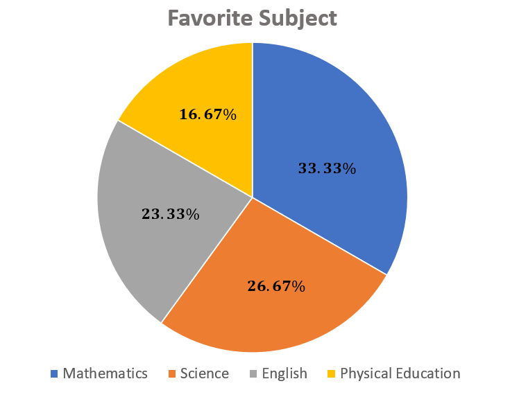
Let us say; for example, you asked your classmates their favorite school subject. Here are the results:
| Subjects | Classmates |
| Mathematics | 10 |
| Science | 8 |
| English | 7 |
| Physical Education | 5 |
| Total = 30 | |
Calculating the percentage of each favorite school subject we have,
| $\frac{10}{30}$×100 0.3333×100 Mathematics=33.33% | $\frac{7}{30}$×100 0.2333×100 English=23.33% |
| $\frac{8}{30}$×100 0.2667×100 Science=26.67% | $\frac{5}{30}$×100 0.1667×100 Physical Education=16.67% |
Multiply each percentage value (decimal form) by 360 to find the degree angle in the circle.
| 0.3333×360 Mathematics=120° | 0.2333×360 English=84° |
| 0.2667×360 Science=96° | 0.1667×360 Physical Education=60° |
Label and color your bar graph as needed.
Bar Graph
Another graph we can use to show the percentage is the bar graph. It can provide an overview comparing the percentages of two or more data categories.
Example: We asked 20 people if they liked blue or red. Here are the results:
| Category | Blue | Red | Total |
| Persons | 8 | 12 | 20 |
Creating A Bar Graph
To manually create a bar graph:
Calculate the percentage values of the data collected.
| Calculate the percentage values of each category. | |
| $\frac{8}{20}$×100 0.40×100 Blue=40% | $\frac{12}{20}$×100 0.60×100 Red=60% |
| Draw two axes, the x-axis, and the y-axis. For a vertical bar graph, mark the y-axis with equal intervals from 0% to 100%. On the x-axis, label with categories. (Do the opposite for a horizontal bar graph) Plot the calculated percentage values from drawing the bars. Label and color your bar graph as needed. |  |
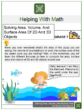
Real-life Application with Solution
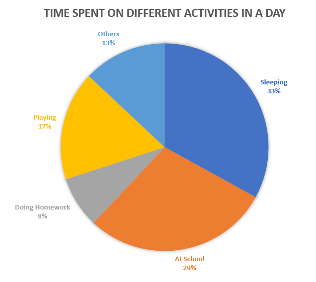
Imagine you are tracking the amount of time you spend on different activities in a day.
Let us say you spend 8 hours sleeping, 7 hours at school, 2 hours doing homework, 4 hours playing, and 3 hours on other activities.
To represent this data in a pie chart:
Calculate the total hours: 8 (sleep) + 7 (school) + 2 (homework) + 4 (play) + 3 (others) = 24 hours.
Find the percentage of time spent on each activity by dividing each activity’s hours by the total hours and multiplying by 100. Note: The values are rounded off to the nearest whole number.
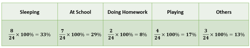
Draw a circle (or pie) and divide it into sections according to the percentages calculated.
Practice Test
1. In a survey of a class of 25 students, 15 said they like science. What percentage of the class likes science?
2. Convert the following percentages to fractions: 25%, 50%, 75%.
3. Convert the following percentages to decimals: 10%, 55%, 98%.
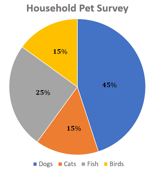
4. Graph the following data on a bar graph: In a pet survey, 45% of households had dogs, 15% had cats, 25% had fish, and 15% had birds.
5. In a group of 120 people, 90 people like chocolate ice cream. What percentage of the group likes chocolate ice cream?
Answers:
1. Sixty percent of students said they like science.
$\frac{15}{25}$×100=60%
2.
$\frac{25}{100}$ or $\frac{1}{4}$
$\frac{50}{100}$ or $\frac{1}{2}$
$\frac{75}{100}$ or $\frac{3}{4}$
3.
$\frac{10}{100}$=0.1
$\frac{55}{100}$=0.55
$\frac{98}{100}$=0.98
4.
5. Seventy-five percent of people like chocolate ice cream.
$\frac{90}{120}$×100=75%
Frequently Asked Questions (FAQs)
How do I convert a decimal to a percentage?
You multiply the decimal by 100 and add the “%” sign. For example, to convert 0.2 to a percentage, you would multiply 0.2 by 100 to get 20%.
What does 100% represent?
100% represents the whole or entirety of something. It means all of it.
How do I represent a percentage greater than 100 on a graph?
It depends on the type of graph. The bar could extend past the line marking 100% for a bar graph. For a pie chart, percentages should always total 100%, so representing a percentage greater than 100% would not be possible.
What is the difference between a fraction and a percentage?
Both fractions and percentages are ways to represent parts of a whole. The main difference is that a percentage is always out of 100, while a fraction can have any number as its denominator.
How can I use percentages in everyday life?
Percentages are used in many areas of daily life, including calculating discounts, determining tips, understanding interest rates, and interpreting statistical data.
Recommended Worksheets
Graphing Percentage (The Great Migration Themed) Math Worksheets
Percentage (Boxing Day Themed) Math Worksheets
Graphing Functional Relationships (Black History Month Themed) Math Worksheets