What will I learn from this article?
After reading this article, you will be able to:
- properly define the range in statistics;
- solve for the range of ungrouped data;
- solve for the range of a frequency table;
- determine the range in a histogram;
- determine the range in a boxplot;
- determine the range in a scatterplot;
- interpret the range of data;
- know the limitations of using range given a data set; and
- properly determine when to use the range.
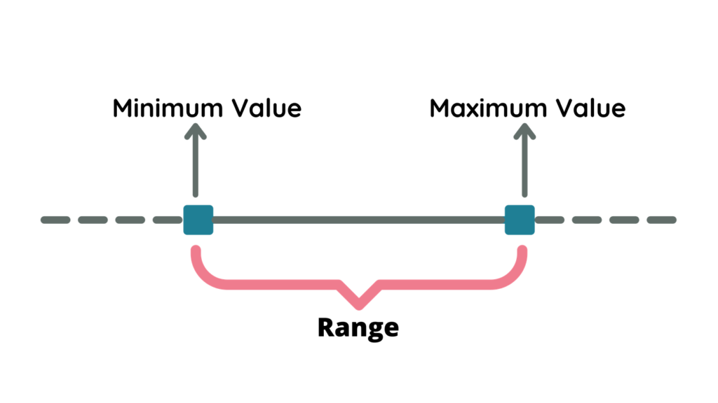
What is a range?
In statistics, a range is the spread of data from the minimum and maximum value in the distribution. It is the most straightforward measure of variability. The range is the easiest measure of variability to calculate and interpret.
Say, for example, we have a data set of 20, 30, 35, 36, 40, 50, 51. The range is 30.
The range can be measured if given ungrouped data, frequency distribution table, graphs such as histogram, boxplot, and scatterplots.
How to calculate the range?
The range of a data set is simply the difference between the maximum and minimum values. Thus, to calculate the range of a data set,
| Range = Maximum Value – Minimum Value |
Calculating the range of an ungrouped data
To calculate the range of ungrouped data,
- Determine the lowest and highest value of the data set.
- Subtract the minimum value from the maximum value.
Example #1
Jennie compared all the prices of 1-kilogram strawberries in the market. She found out that the highest price of 1-kilogram strawberry costs $18 and the lowest price costs $5. What is the price range of strawberries in the market?
Solution
Given the highest value = $18 and the lowest value = $5
Then, using the formula of range,
Range = Maximum value – Minimum value
Range = $18 – $5
Range = $13
Therefore, the price range of strawberries is $13.
Example #2
Jisoo listed the first 15 multiples of 4 and decided to find the range. What is the range of the data set Jisoo has?
Solution
Step 1: List all the first 15 multiple of 4. Hence, the data set is:
4, 8, 12, 16, 20, 24, 28, 32, 36, 40, 44, 48, 52, 56, 60
Step 2: Determine the minimum and maximum value.
Minimum value = 4
Maximum value = 60
Step 3: Solve for the range. Thus,
Range = Maximum value – Minimum value
Range = 60 – 4
Range = 56

Therefore, the range of the data set is 56.
Example #3
The scores of the students on their recent math quiz are listed in the table below. Determine the range of the data.
10, 34, 36, 32, 21, 45, 48, 43, 24, 45, 34, 49, 23, 27, 19
Solution
Step 1: Determine the lowest and highest value in the data set. Thus,
Lowest value = 10
Highest value = 49
Step 2: Find the range of the data set using the formula. Hence,
Range = Maximum value – Minimum value
Range = 49 – 10
Range = 39
Therefore, the range of the data is 39.
Calculating the range of a frequency table
To find the range of a frequency table,
- Make sure the entries in the score column are in ascending or descending order.
- Find the lowest and highest entry in the frequency table.
- Subtract the lowest entry from the highest entry.
Example #1
The age of the Math Club members is represented in the frequency table below.
What is the range of the data set?
| Age | Frequency |
| 19 | 2 |
| 18 | 3 |
| 17 | 4 |
| 16 | 5 |
| 15 | 5 |
| 14 | 6 |
| 13 | 7 |
Solution
Step 1: Determine the lowest and highest entry in the frequency table. The column of age represents the scores of the data. Thus,
Lowest value = 13
Highest value = 19
Step 2: Solve for the range.
Range = Maximum value – Minimum value
Range = 19 – 13
Range = 6
Therefore, the range of the data is 6.
Example #2
The students were asked to answer a survey about the average number of hours they usually study on weekends. The result of the study is shown in the frequency table below. Find the range of the data set.
| Number of Hours | Frequency |
| 10 | 0 |
| 9 | 22 |
| 8 | 13 |
| 7 | 20 |
| 6 | 15 |
| 5 | 30 |
| 4 | 12 |
| 3 | 23 |
| 2 | 12 |
| 1 | 2 |
Solution
Step 1: Determine the lowest and highest score in the frequency table. In the frequency table, the highest entry is 10 and the lowest entry is 1. However, the frequency of 10 is 0. Hence, we will not consider 10 as part of the data set. Thus,
Lowest value = 1
Highest value = 9
Step 2: Solve for the range.
Range = Maximum value – Minimum value
Range = 9 – 1
Range = 8
Therefore, the range of the data is 8.
Example #3
In a company survey, the employees were asked about their average monthly spending on transportation. The result of the study is translated into a frequency table. Determine the range of the data.
| Monthly Allowance on Transportation | Frequency |
| 500 | 0 |
| 450 | 11 |
| 400 | 0 |
| 350 | 10 |
| 300 | 9 |
| 250 | 6 |
| 200 | 20 |
| 150 | 12 |
| 100 | 8 |
| 50 | 0 |
Step 1: Determine the lowest and highest score in the frequency table. In the frequency table, the highest entry is 500 and the lowest entry is 50. However, the frequency of 500 and 50 is 0. Hence, we will not consider both of those numbers as part of the data set. Thus,
Lowest value = 450
Highest value = 100
Step 2: Compute for the value of the range.
Range = Maximum value – Minimum value
Range = 450 – 100
Range = 350
Therefore, the range of the data is 350.
Take Notes:
- Make sure that the data is in ascending or descending order.
- Be careful of data scores that have a frequency of 0, especially if it is in the upper and lower limits.
- The value of the range cannot be negative.
How to find the range in graphs?
Range can also be defined in several graphs, such as histograms, boxplots, and scatterplots.
Range in histograms
To determine the range in a histogram, observe the highlighted blue line. The range in a histogram is determined by the width that the bar cover along the x-axis. The range in a histogram is only the approximate value since the data in a histogram is not the raw data values.
Consider the histogram below.
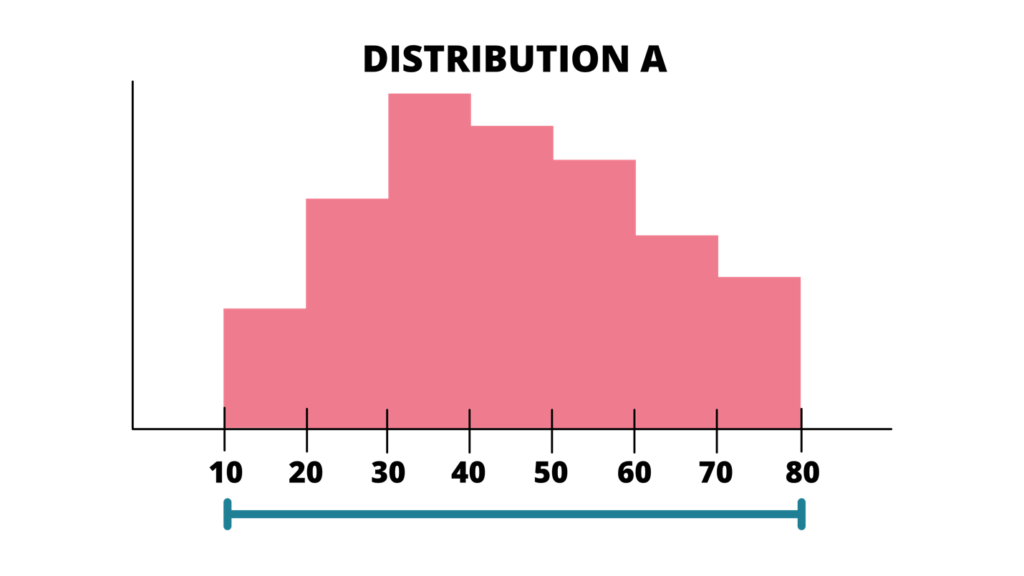
The blue line represents the range of Distribution A. Using the same formula of the range, determine the upper and lower limit. Thus, 10 is the lower limit and 80 is the upper limit.
Hence, using the same formula for range,
Range = Maximum Value – Minimum Value
Range = 80 – 10
Range = 70
Therefore, the range of Distribution A is 70.
Example
Determine the range of the distribution below.
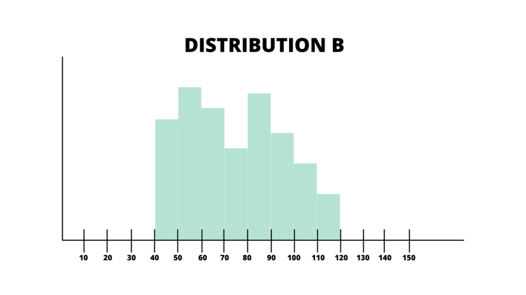
Solution
Step 1: Determine the upper and lower limit of Distribution B. Thus,
Lower limit = 40
Upper limit = 120
Step 2: Find the range of the distribution.
Range = Maximum Value – Minimum Value
Range = 120 – 40
Range = 80
Therefore, the range of Distribution B is 80.
Range in boxplots
Boxplots show data ranges for groups within a dataset. In boxplots, the minimum and maximum values appear at the ends of the whiskers except when there are outliers.
Consider the box plot below.
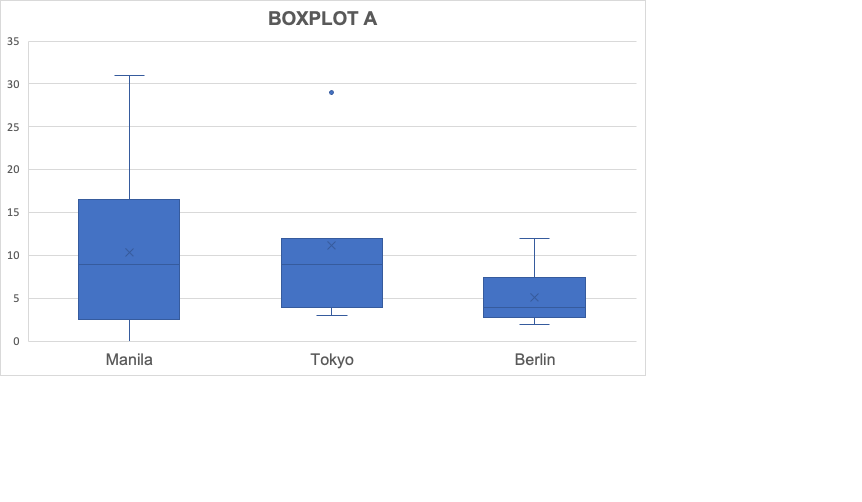
In this box plot, the scores in Manila range from 3 to 16. Thus, getting the range in the scores of Manila, simply use the same formula in solving for the range.
- Range of Scores in Manila
Range = Maximum Value – Minimum Value
Range = 16 – 3
Range = 13
- Range of Scores in Tokyo
Range = Maximum Value – Minimum Value
Range = 12 – 4
Range = 8
- Range of Scores in Berlin
Range = Maximum Value – Minimum Value
Range = 8 – 3
Range = 5
Therefore, the range of scores in Manila, Tokyo, and Berlin are 13, 8, and 5, respectively.
Example
Consider the boxplot and determine the range of the boxplot.
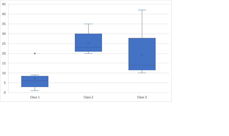
Solution
Step 1: Determine the range of the given boxplot, estimate the lowest and highest value in the graphs of Class 1, Class 2, and Class 3.
- In Class 1, the lowest point is in the middle of 0 and 5 and the highest point is closer to 10. Thus, we can say that the minimum value in Class 1 is 3 and the maximum value is 9.
- In Class 2, the lowest value is close to 20 and the highest value is positioned exactly in 30. Thus, the minimum value in Class 2 is 21 and the maximum value is 30.
- In Class 3, the lowest value is close to 10 and the highest value is positioned in the middle of 25 and 30. Thus, the minimum value in Class 3 is 11 and the maximum value is 28.
Step 2: Use the formula of the range.
- Range of Scores in Class 1
Range = Maximum Value – Minimum Value
Range = 9 – 3
Range = 6
- Range of Scores in Class 2
Range = Maximum Value – Minimum Value
Range = 30 – 21
Range = 9
- Range of Scores in Class 3
Range = Maximum Value – Minimum Value
Range = 28 – 11
Range = 17
Therefore, the range in Class 1 is 6. The range in Class 2 is 9, and the range in Class 17. Moreover, you can see the isolated point in Class 1 positioned at 20. The data with a score of 20 is the outlier in the data set for Class 1.
Range in scatterplots
Scatterplots allow you to determine the range of two variables simultaneously. It is the height of the data for the y-axis variable and the breadth of the data for the x-axis variable.
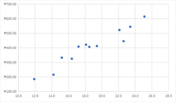
In determining the range of a scatterplot, simply observe the lowest point and the location of the highest point of the scatterplot. Since the lowest point is close to 200, we can approximate it at somewhere around 195. The highest point is close to 600, we can estimate it to be 605. Thus, the range of the scatterplot is given by:
Range = Maximum Value – Minimum Value
Range = 605 – 195
Range = 410
Therefore, the range of the scatterplot is 410.
How to interpret the range of the data set?
After getting the range of the data set, you might ask – what’s next? What does this number tell us about the data? We already know that the range is one of the methods we use to see the dispersion of the data set. So, the larger the range is, the broader its range is. Hence, it is more variable.
Consider the two data sets below.
| Data Set #1 | |
| Score | Frequency |
| 2 | 3 |
| 3 | 4 |
| 4 | 5 |
| 5 | 5 |
| 6 | 6 |
| 7 | 7 |
| Data Set #2 | |
| Score | Frequency |
| 10 | 3 |
| 20 | 4 |
| 30 | 5 |
| 40 | 5 |
| 50 | 6 |
| 60 | 7 |
If we compare the range of the two data sets, we will have the range of Data Set #1 as 5 and the range of Data Set #2 as 50. If we are asked to interpret the two data sets, we will conclude that the range of Data Set #2 is larger. Thus, Data Set #2 is more variable.
Further, if you are asked to interpret the range between different classes in a boxplot, consider the graph below:

In this box plot, we can easily see the difference in the ranges of Class 1, Class 2, and Class 3. Observe that the graph in Class is shorter – hence, the scores are less spread than Class 2 and Class 3. We can also note that the graph in Class 3 shows that the scores are most spread. Moreover, you can observe an outlier that exists in Class 1, which is positioned in the score of 20.
What are the limitations of range?
Having outliers in the data set
While the range is straightforward, it does have certain limits to consider. Unfortunately, outliers have a significant influence on it, as it only uses the two most extreme data. If a single number in the dataset is abnormally low or high, it changes the entire range.
Sample size
The sample size also influences this statistic. The range tends to increase as the sample size increases. As a result, values cannot be compared between samples of varying sizes. In general, extreme values have a decreased likelihood of occurring.
However, as the sample size increases, the likelihood of encountering extreme results also increases. As a result, as the sample size increases, the range tends to widen.
If you wish to compare the variability of datasets of varying sizes, an alternative measure, such as the standard deviation, should be used.
When to use the range?
If an intuitive statistic is needed
The range is an excellent metric when a straightforward statistic indicating the degree of data dispersion is required. Everybody understands the concept of maximum and lowest data points.
Rapid assessment
Additionally, when you require a rapid assessment, it is simple to calculate in your head utilizing summary statistics.
Small data sets
When working with tiny datasets and comparing samples of similar size, use the range to avoid outliers.
Detecting data entry problems
It is a remarkable statistic for detecting data entry problems. Due to its susceptibility to outliers, a single error can appear.
It can be used to solve standard deviation
The range can be used to calculate another type of spread, the standard deviation. Rather than going through a very lengthy procedure, we may simply use what is known as the range rule to determine the standard deviation. The range plays a critical role in this calculation.
Using for quality control
Quality control analysts frequently use this particular metric of variability. To begin, if the range of a batch of items exceeds the spread between the higher and lower specification limits, they know that at least one component is out of specification.
For instance, if the range of part lengths is 10 mm, but the spread for specification limits is 5 mm, there must be some parts that are not within specification.
Additionally, quality control analysts employ R charts, which are a subset of control charts. These graphs keep track of a process’s variance by plotting the range across time. They use R charts to analyze small (n = 2 – 10), consistently sized batches of a product derived from a steady process, avoiding the limitations discussed. These graphs enable the rapid detection of processes with unstable variability.
Recommended Worksheets
Comparing Data Using “Less” and “More” 1st Grade Math Worksheets
Box Plots (Box and Whisker Plots) (Construction Themed) Math Worksheets
Representing Data using Table and Charts 1st Grade Math Worksheets