Download Constructing Statistical Displays Worksheets
Click the button below to get instant access to these premium worksheets for use in the classroom or at a home.
This worksheet can be edited by Premium members using the free Google Slides online software. Click the Edit button above to get started.
Download free sample
Not ready to purchase a subscription yet? Click here to download a FREE sample of this worksheet pack.
Definition:
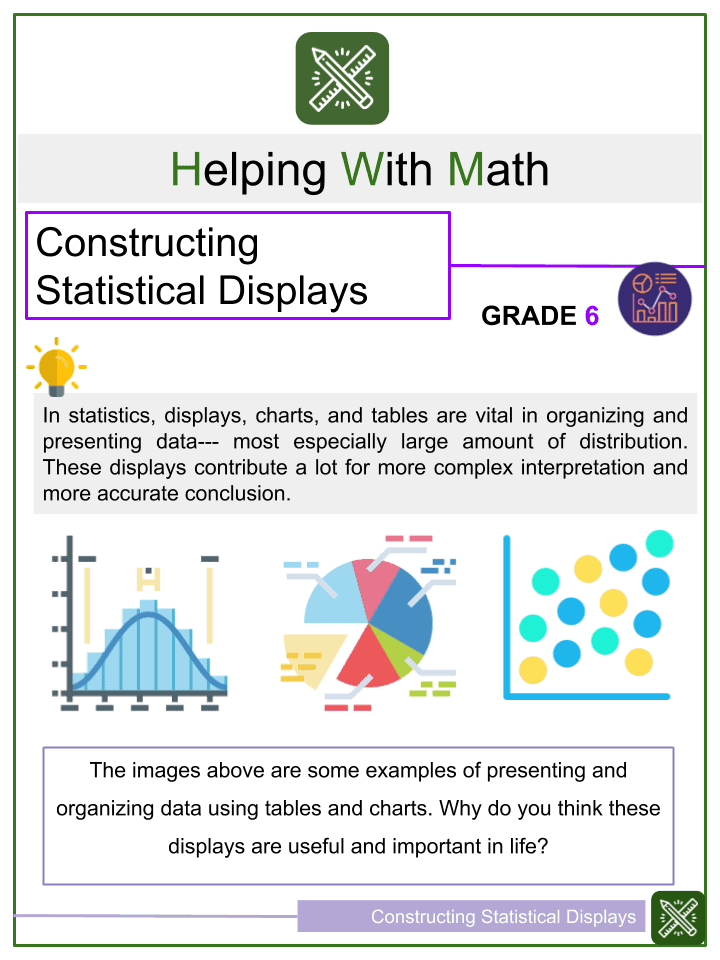
In statistics, displays, charts, and tables are vital in organizing and presenting data— most especially large amount of distribution. These displays contribute a lot for more complex interpretation and more accurate conclusion.
Summary:
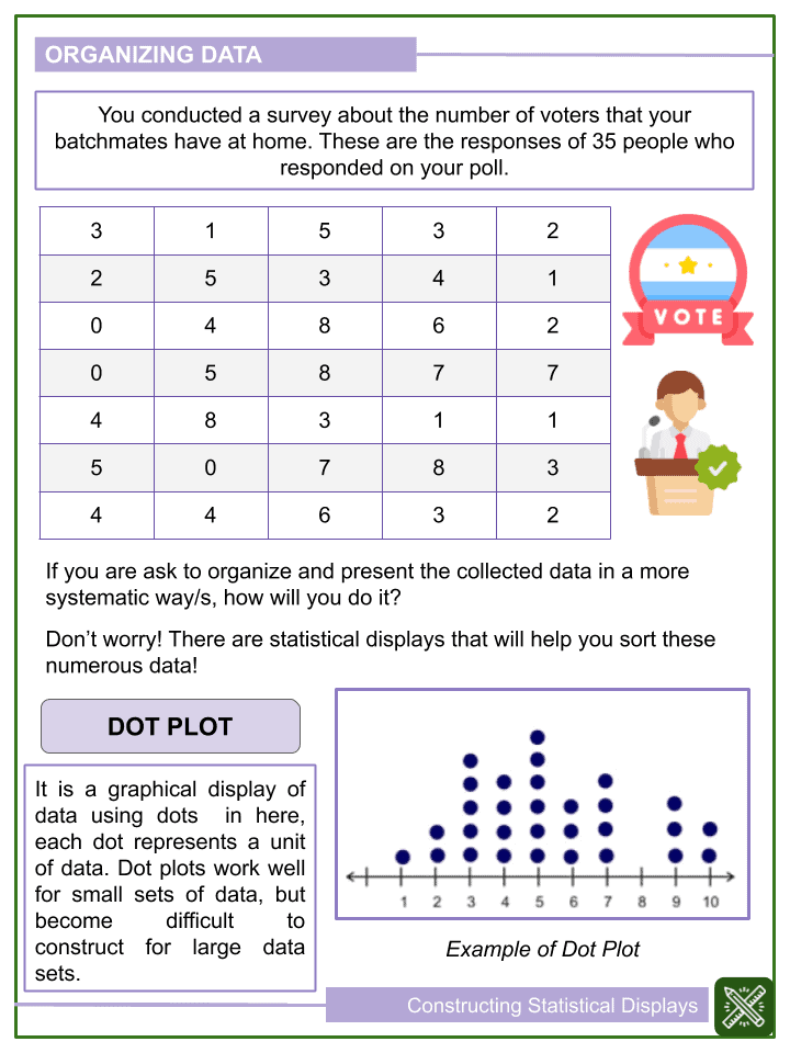
DOT PLOT
It is a graphical display of data using dots in here, each dot represents a unit of data. Dot plots work well for small sets of data, but become difficult to construct for large data sets.
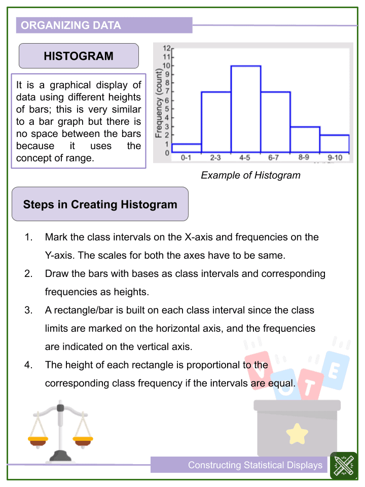
HISTOGRAM
It is a graphical display of data using different heights of bars; this is very similar to a bar graph but there is no space between the bars because it uses the concept of range.
Steps in Creating Histogram
- Mark the class intervals on the X-axis and frequencies on the Y-axis. The scales for both the axes have to be same.
- Draw the bars with bases as class intervals and corresponding frequencies as heights.
- A rectangle/bar is built on each class interval since the class limits are marked on the horizontal axis, and the frequencies are indicated on the vertical axis.
- The height of each rectangle is proportional to the corresponding class frequency if the intervals are equal.
BOX PLOTS
Also called box-and-whisker plots or box-whisker plots.
Provide a good graphical image of the concentration of the data.
They also show how far the extreme values are from most of the data.
A box plot is constructed from five values: the minimum value, the first quartile, the median, the third quartile, and the maximum value.
Steps in Creating Box Plots
- To construct a box plot, use a horizontal or vertical number line and a rectangular box.
- The smallest and largest data values label the endpoints of the axis.
- The first quartile marks one end of the box and the third quartile marks the other end of the box. Approximately the middle 50 percent of the data fall inside the box. The “whiskers” extend from the ends of the box to the smallest and largest data values.
- The median or second quartile can be between the first and third quartiles, or it can be one, or the other, or both.
Constructing Statistical Displays Worksheets
This is a fantastic bundle which includes everything you need to know about Constructing Statistical Displays across 15+ in-depth pages. These are ready-to-use Common core aligned Grade 6 Math worksheets.
Each ready to use worksheet collection includes 10 activities and an answer guide. Not teaching common core standards? Don’t worry! All our worksheets are completely editable so can be tailored for your curriculum and target audience.
Resource Examples
Click any of the example images below to view a larger version.